Cart
0
You may also like

Book a call with our development team to get started.


Apply online and access wholesale pricing.

Your packaging is often the first physical touchpoint a customer has with your brand. For small businesses competing against established names, that first impression matters. Branded packaging small business owners invest in doesn't just protect products—it communicates who you are, what you stand for, and why someone should remember you. The difference between a plain kraft box and one with your logo, brand colors, and thoughtful finishing touches can shift a customer's perception from "generic product" to "professional brand worth following."
This guide walks through the practical decisions that turn stock packaging into custom packaging for small businesses: where to place your logo for maximum impact, how to choose between one-color and full-color printing based on budget and brand identity, and when specialty techniques like foil stamping or embossing justify the added cost. You'll also learn how to maintain visual consistency across multiple packaging formats—a challenge many growing businesses face as they expand product lines or sales channels.
According to Packaging Digest, custom packaging creates unique and memorable experiences by delivering brand promises through differentiating design elements, shapes, colors, and materials. For small businesses operating on limited marketing budgets, packaging functions as a silent sales tool that works long after the initial purchase—especially when customers share unboxing experiences on social media or reuse attractive boxes.
Branded packaging also builds trust. When a customer receives a professionally designed box with consistent logo placement and quality printing, it signals that you've invested in your business and care about details. This perceived quality extends to the product inside. Conversely, a premium product arriving in unmarked packaging or a box with misaligned printing undermines the value you've worked to create.
The investment doesn't require enterprise-level budgets. Many print vendors now offer digital printing options with low minimum order quantities, making branded packaging accessible even for businesses fulfilling fewer than 100 orders per month. The key is understanding which branding elements deliver the most impact for your specific budget and product category.
Logo placement on packaging follows different rules than business cards or websites. The goal is visibility at multiple touchpoints: when the box sits on a doorstep, when a customer opens it, and when it's photographed or stored. Most effective branded packaging incorporates your logo in at least two locations.
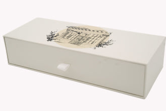
The exterior lid or front panel is non-negotiable. This is the first surface customers see when a package arrives. Center placement works well for square or rectangular boxes, while corner placement can create a more modern, asymmetrical look. Size matters—your logo should occupy roughly 15-25% of the visible surface area. Smaller than that, and it reads as an afterthought; larger risks overwhelming the design.
Interior placement adds a second brand moment during unboxing. The inside of the lid is prime real estate. When a customer lifts the lid, your logo appears at eye level before they see the product. This is where you can afford to be more creative—adding a tagline, a thank-you message, or a pattern that incorporates your brand mark.
Side panels offer functional branding opportunities. If your packaging will be stacked on retail shelves or stored visibly, a vertical logo on the side ensures brand recognition from any angle. For shipping boxes, this is also where you might place handling instructions or sustainability messaging alongside a smaller version of your logo.
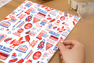
Tape and stickers provide low-cost branding for businesses not ready to invest in fully custom printed boxes. Custom tape with a repeating logo pattern turns a plain kraft mailer into a branded experience. Similarly, a well-designed sticker sealing a stock box delivers visual impact at a fraction of the cost of custom printing.
The choice between one-color and full-color printing affects both your budget and brand perception. One-color printing (also called spot color or single-color) uses a single ink—typically black, white, or a specific Pantone color—applied directly to the packaging substrate. Full-color printing (CMYK process) uses four inks layered to reproduce photographs, gradients, and complex color palettes.
One-color printing costs significantly less, especially at lower quantities. Setup is simpler, print runs are faster, and you avoid the color-matching complexities of CMYK. For brands with minimalist identities or those working with natural kraft substrates, one-color printing can look intentionally refined rather than budget-constrained. A crisp black logo on a kraft box, for instance, communicates eco-conscious simplicity—a positioning many consumers actively seek.
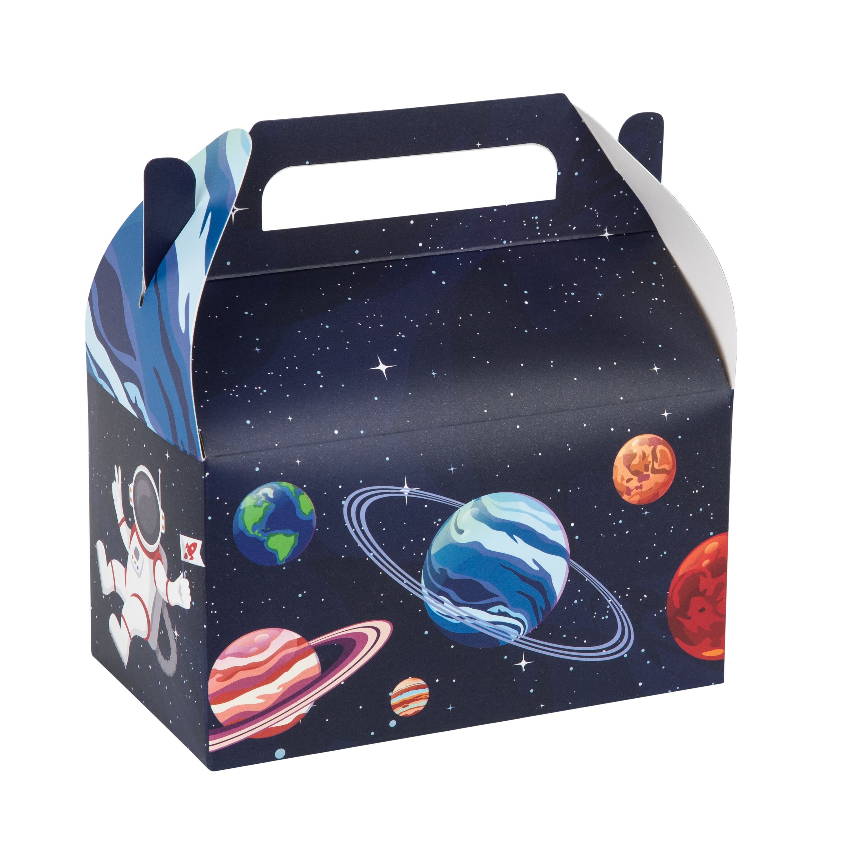
Full-color printing makes sense when your brand identity depends on specific color combinations, when you need to reproduce product photography on the packaging, or when competing in categories where vibrant packaging is the norm. Cosmetics, toys, and food products often require full-color to convey freshness, playfulness, or appetite appeal. The cost premium—often 30-50% more than one-color—buys you flexibility to include multiple brand colors, gradients, and photographic elements.
A middle-ground option is two-color printing, which uses two spot colors. This allows you to incorporate your primary brand color plus black (for text and fine details) or a secondary accent color. Two-color printing delivers more visual interest than single-color without the cost jump to full CMYK. It's particularly effective for brands with strong, recognizable color identities—think a signature red or teal that customers associate with your business.
When evaluating printing options, request samples printed on your actual substrate. Colors behave differently on coated vs uncoated paper, on white vs kraft, and on matte vs glossy finishes. What looks vibrant on a coated white box may appear muted on recycled kraft. Testing ensures your brand colors translate as intended across different packaging materials.
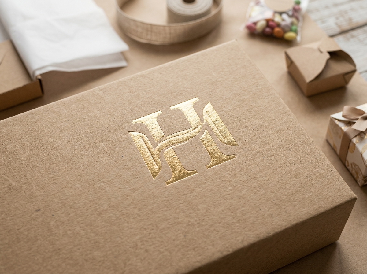
Foil stamping applies a thin metallic or pigmented foil layer to packaging using heat, pressure, and custom metal dies. The result is a reflective, eye-catching finish that signals premium quality. According to industry sources, foil stamping uses heated dies pressed against foil to bond it to substrates like paper, creating sharp, detailed imprints ideal for intricate designs.
The most common foil colors are gold and silver, but specialty foils include rose gold, copper, holographic, and even matte metallics. Gold foil works well for luxury positioning—think high-end chocolates, jewelry, or skincare. Silver reads as modern and sleek, suitable for tech accessories or minimalist beauty brands. Holographic foils create a playful, attention-grabbing effect popular in cosmetics and stationery.
Foil stamping works best on smooth, uncoated substrates. Textured papers can prevent complete foil adhesion, resulting in patchy coverage. The technique is typically applied to logos, brand names, or decorative borders rather than large solid areas, which can look heavy-handed and increase cost substantially.
From a budget perspective, foil stamping requires a one-time die creation fee (often $100-300 depending on size and complexity) plus a per-unit application cost. This makes it most economical at moderate to high quantities—typically 500 units or more. Below that threshold, the die setup cost per box becomes prohibitive unless the premium positioning justifies it.
One strategic approach is to reserve foil stamping for limited-edition packaging, seasonal releases, or higher-priced product tiers. A bakery might use standard one-color printing for everyday orders but add gold foil to holiday gift boxes. This creates differentiation within your packaging line without requiring foil on every single unit.
Combining foil stamping with embossing creates a multi-dimensional effect. The foil provides color and shine while the emboss adds tactile depth. This combination, sometimes called "registered embossing," is among the most luxurious finishes available and is commonly used for wedding invitations, premium spirits packaging, and high-end cosmetics.
Embossing creates a raised design on packaging by pressing the substrate between custom male and female dies under heat and pressure. The result is a three-dimensional element you can both see and feel. Debossing is the inverse—it creates a recessed impression by pressing the design into the surface.
Both techniques add a tactile quality that flat printing cannot replicate. When a customer runs their hand over an embossed logo, it creates a sensory brand moment that reinforces memory and perceived quality. This is why embossing appears frequently on luxury goods packaging, business cards for professional services, and premium gift boxes.
Blind embossing—embossing without ink or foil—creates a subtle, sophisticated effect. The design appears only through light and shadow, which works particularly well on textured papers or when you want the packaging material itself to be the hero. A structured gift box with a blind-embossed logo on the lid communicates confidence and restraint.
Registered embossing combines embossing with ink or foil, so the raised area is also colored. This delivers maximum impact—the design is visible through color, elevated through dimension, and tactile through touch. The setup is more complex and costly, requiring precise alignment between the embossing dies and the printing plates, but the result justifies the investment for brands positioning at the premium end of their category.
Like foil stamping, embossing requires custom dies and is most cost-effective at higher quantities. The dies themselves are more expensive than foil stamping dies because they must be precisely matched pairs. Expect die costs starting around $200-500 depending on size and detail complexity. Per-unit costs decrease significantly above 1,000 units, making embossing a better fit for established product lines than initial test runs.
Debossing tends to be slightly less expensive than embossing because it requires less pressure and can work with simpler die configurations. It also works better on thinner substrates that might buckle under the pressure required for embossing. For kraft boxes and other eco-friendly materials, debossing often delivers a cleaner result than embossing.
Brand color consistency becomes challenging when you're printing across different substrates, using different vendors, or mixing printing techniques. A blue that looks perfect on coated cardstock may shift toward purple on uncoated kraft. A color that reproduces accurately in CMYK might require a custom Pantone mix when you switch to one-color printing.
The solution starts with defining your brand colors in multiple color systems. Your brand guidelines should specify Pantone (PMS) values for spot color printing, CMYK values for full-color printing, RGB for digital use, and hex codes for web. When ordering packaging, provide your vendor with the appropriate color specification for their printing method. Don't assume they'll convert RGB to CMYK accurately—color space conversions introduce shifts.
Request printed samples on your actual substrate before approving a full production run. Colors behave differently on white vs kraft, glossy vs matte, and virgin vs recycled paper. If you're using multiple packaging formats—say, boxes, tissue paper, and stickers—order samples of each to ensure color consistency across the full unboxing experience.
Understand that perfect color matching across different materials and printing methods is often impossible. Instead, aim for "acceptable variation"—colors that read as the same family even if a colorimeter would detect differences. A navy blue logo might be slightly lighter on kraft than on white coated stock, but as long as both read as "navy" to the human eye, the brand remains cohesive.
For businesses printing with multiple vendors or across different product lines, consider building flexibility into your brand identity. Using a neutral color (black, white, kraft natural) as a primary element with your signature color as an accent reduces the impact of color variation. A black logo with a signature teal underline, for example, remains recognizable even if the teal shifts slightly between print runs.
Your logo isn't the only text element on branded packaging. Depending on your product and sales channel, you may need to include product names, ingredient lists, usage instructions, sustainability certifications, or regulatory information. Organizing this text hierarchy ensures your branding remains prominent while meeting functional requirements.
Establish a clear visual hierarchy: brand name and logo are primary, product-specific information is secondary, and regulatory or instructional text is tertiary. Use size, weight, and placement to reinforce this hierarchy. Your logo might occupy the lid at 2 inches tall, the product name appears on the front panel at 1 inch, and ingredients are listed on the back or bottom in 8-point type.
Choose typefaces that align with your brand personality but remain legible at small sizes. Script fonts and ultra-thin weights can look elegant at large sizes but become illegible when reduced for ingredient lists or care instructions. Many successful packaging designs use a distinctive typeface for the brand name and a neutral sans-serif for functional text.
Contrast is critical for readability. Black text on white or kraft provides maximum legibility. Reversed text (white on dark backgrounds) works well for headlines but can strain readability at small sizes. Avoid low-contrast combinations like light gray on white or pastel text on kraft—these fail accessibility standards and frustrate customers trying to read instructions.
Consider multilingual requirements if you're selling across regions or to diverse customer bases. Adding a second language doesn't mean doubling all text—often you can provide core information (product name, key benefits) in both languages while keeping detailed instructions in the primary market language or directing customers to a QR code for translations.
As your business grows, you'll likely need packaging in multiple sizes, formats, or product categories. Maintaining visual consistency across this expanding portfolio prevents brand dilution and helps customers recognize your products instantly, regardless of which item they encounter first.
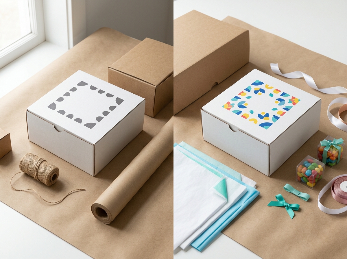
Develop a flexible packaging system rather than designing each SKU in isolation. Define consistent elements that appear across all packaging: logo placement (always top-left or always centered), a signature color band or pattern, a specific typeface for product names, or a distinctive finishing technique. These anchors allow individual products to have unique characteristics while remaining unmistakably part of your brand family.
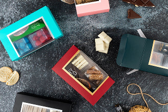
Use color coding to differentiate product lines or variants while maintaining overall brand unity. A skincare brand might use the same box structure and logo placement across all products but vary the accent color—blue for hydrating products, green for clarifying, pink for anti-aging. Customers learn the color system quickly, making it easier to find their preferred products while reinforcing that all belong to the same brand.
Document your packaging standards in a brand guidelines document that you share with vendors and internal teams. Include specifications for logo placement, minimum clear space around logos, approved color values, typeface usage, and finishing techniques. This ensures consistency even when working with multiple suppliers or when bringing new products to market months or years after your initial packaging design.
When expanding into new product categories or sales channels, resist the temptation to completely redesign packaging. Instead, adapt your existing system. If you've been selling candles in round tins and you're adding diffusers in glass bottles, maintain your logo treatment, color palette, and typography even though the package structure changes. The visual language should remain consistent even as the physical format evolves.
For businesses managing minimum order quantities across multiple SKUs, consider whether a single package design with variable labels or stickers might be more efficient than fully custom printing for each variant. A neutral base box with a custom sticker identifying the specific product inside reduces inventory complexity and can lower overall packaging costs while still delivering a branded experience.
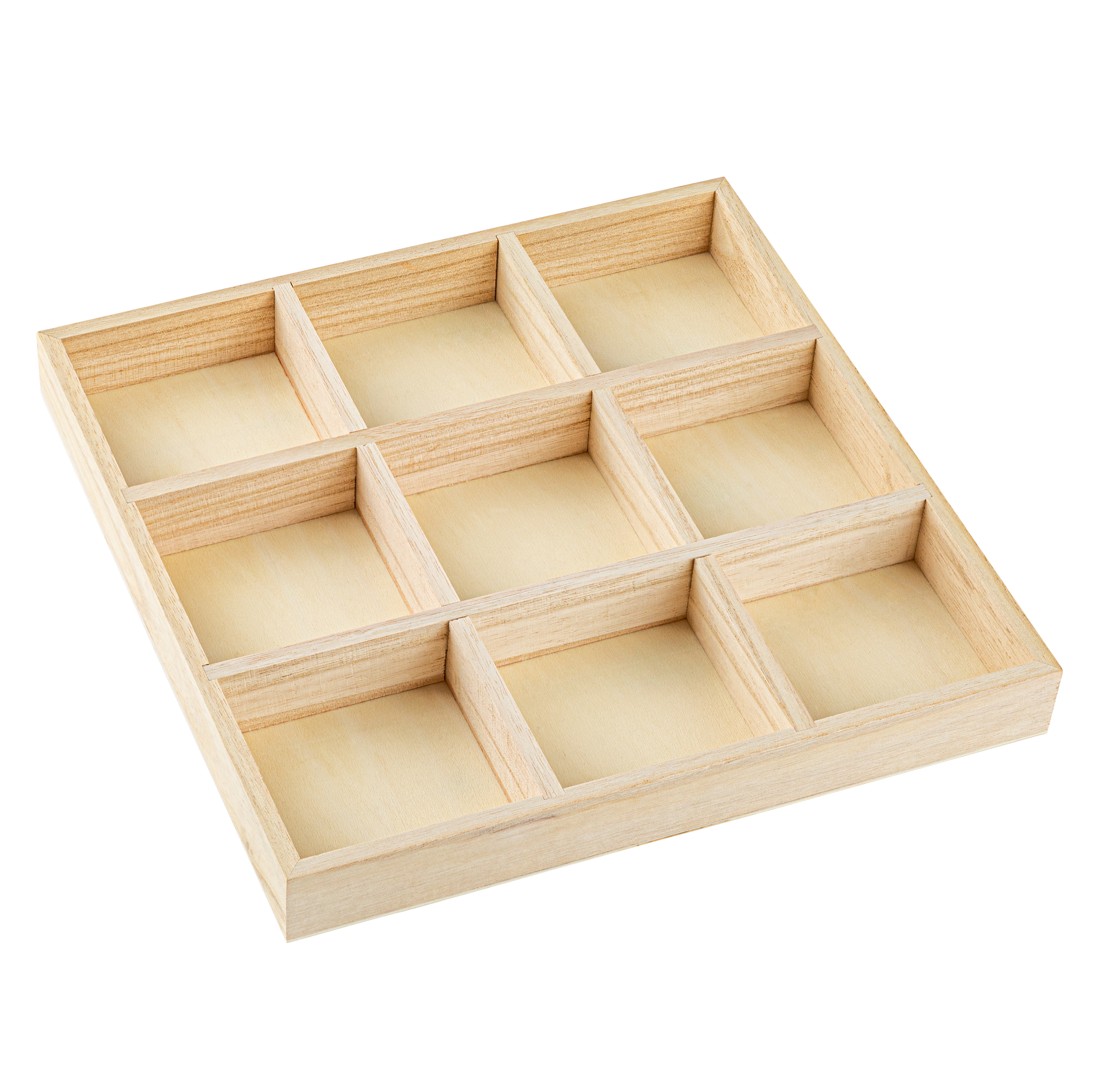
Not every small business can invest in custom die-cut boxes with foil stamping and embossing. Fortunately, several approaches deliver professional branding at accessible price points, especially when you're just starting or testing new products.
Stock boxes with custom stickers offer the lowest barrier to entry. Many packaging suppliers sell plain kraft or white boxes in standard sizes at commodity pricing. Adding a custom-printed sticker with your logo transforms these generic boxes into branded packaging for pennies per unit. Stickers also provide flexibility—you can use the same box for multiple products and differentiate them with different sticker designs.
Custom stamps create a handcrafted aesthetic that resonates with customers seeking authenticity. A rubber stamp with your logo costs $20-50 and can brand hundreds of boxes, bags, or tissue sheets. Stamping works particularly well for businesses with a maker or artisan positioning—bakeries, handmade soaps, small-batch preserves. The slight variation in each stamped impression adds character rather than looking like a defect.
Digital printing has dramatically lowered the cost and minimum quantities for custom packaging. Where offset printing might require 5,000-10,000 units to be economical, digital printing can produce fully custom boxes in quantities as low as 50-100 units. The per-unit cost is higher than offset, but the elimination of plate fees and the ability to order smaller quantities makes digital printing ideal for small businesses, seasonal products, or limited editions.
Investing in one premium element can elevate otherwise simple packaging. A plain kraft box with a single foil-stamped logo looks more sophisticated than a fully printed box with mediocre design. Choose the one element—foil, embossing, a custom die-cut window, premium ribbon—that best reinforces your brand positioning and execute it well rather than spreading your budget across multiple techniques that all end up looking compromised.
Collaborate with other small businesses to reach minimum order quantities. If you need 250 custom boxes but the MOQ is 1,000, find three other businesses with similar size requirements and split an order. You'll each need to use the same box structure and printing method, but you can have different designs, logos, and colors. This approach works particularly well within maker collectives, co-working spaces, or industry associations.
Translating your brand vision into physical packaging requires clear communication with vendors. Packaging suppliers and printers work with dozens of clients and can't intuit your specific brand aesthetic without guidance. Providing the right information upfront prevents costly revisions and ensures the final product matches your expectations.
Start with a creative brief that outlines your brand positioning, target customer, and the role this packaging plays in your business. Are you positioning as luxury or accessible? Eco-conscious or convenience-focused? Playful or serious? This context helps vendors recommend appropriate materials, printing techniques, and finishing options that align with your brand rather than just quoting the cheapest option.
Provide vector logo files (AI, EPS, or PDF) rather than raster images (JPG, PNG). Vector files can be scaled to any size without quality loss and are required for most professional printing processes. If you only have a raster logo, have it redrawn as a vector before starting packaging design—this prevents pixelation and reproduction issues.
Share visual references of packaging you admire, even if it's from completely different industries. A collection of 5-10 images showing packaging styles, color treatments, or finishing techniques you're drawn to gives vendors concrete examples of your aesthetic preferences. Be specific about what you like in each reference—is it the color palette? The minimalist layout? The use of foil? This specificity prevents misinterpretation.
Request a physical sample or proof before approving a full production run. Digital mockups are helpful for visualizing design, but they can't show you how your logo looks foil-stamped on actual kraft paper or how colors reproduce on uncoated stock. Most vendors charge for samples, but this cost is trivial compared to discovering issues after printing 1,000 boxes. If you're working with a new vendor or trying a new printing technique, samples are non-negotiable.
Understand lead times and build them into your planning. Custom packaging typically requires 2-4 weeks for design and sampling, plus another 2-6 weeks for production depending on quantity and complexity. Rush fees can double or triple costs. If you're launching a product for a specific season or event, work backward from that date to determine when you need to finalize packaging designs and place orders.
Branded packaging represents a meaningful investment for small businesses, and you should track whether it's delivering returns. Unlike digital advertising with immediate metrics, packaging ROI often appears in indirect measures: customer retention, social media engagement, and perceived brand value.
Monitor social media for unboxing content. Search your brand name plus "unboxing" on Instagram, TikTok, and YouTube. Count how many customers photograph or video their packaging experience. Compare this metric before and after upgrading to branded packaging. An increase in user-generated content indicates your packaging is creating shareable moments—free marketing that extends your reach.
Track repeat purchase rates. Customers who receive professional, branded packaging may perceive your business as more established and trustworthy, increasing the likelihood they'll order again. Compare repeat purchase rates between customers who received generic packaging and those who received branded packaging. Even a 5-10% increase in retention can justify the packaging investment.
Survey customers about their unboxing experience. Include a question in post-purchase surveys asking customers to rate their satisfaction with packaging on a 1-5 scale and whether the packaging influenced their perception of product quality. This qualitative feedback helps you understand whether your packaging investments are landing as intended.
Calculate the cost per impression. If you're spending an additional $2 per box on branded packaging versus generic, but that box is photographed and shared with 500 people on social media, you've achieved a cost per impression of $0.004—far lower than paid advertising. Not every box will be shared, but even a 10% share rate delivers impressive reach.
Compare packaging costs to other customer acquisition channels. If branded packaging increases your repeat purchase rate by 8% and your average customer lifetime value is $200, that 8% increase is worth $16 per customer. If your branded packaging costs $3 more per unit than generic, you're generating a 5x return on that investment through retention alone, not counting new customer acquisition through social sharing.
Even with good intentions, small businesses often make predictable mistakes when developing branded packaging. Awareness of these pitfalls helps you avoid costly errors.
Overdesigning is perhaps the most common mistake. In an attempt to make packaging "pop," businesses cram every surface with logos, patterns, product information, and decorative elements. The result is visual chaos that obscures rather than clarifies your brand. Effective packaging has breathing room—negative space that allows key elements to stand out. If you're uncertain whether your design is too busy, it probably is. Simplify.
Ignoring the substrate is another frequent error. Designers working in digital files often fail to account for how their design will interact with the actual packaging material. A design that looks crisp on white coated stock may appear muddy on recycled kraft. Colors that work beautifully on smooth paper can bleed or mottle on textured surfaces. Always review designs on the actual material you'll be printing on.
Skipping prototypes to save money almost always backfires. The cost of a prototype is minimal compared to discovering that your logo is illegible, your colors don't match, or your box structure doesn't protect the product after you've printed 1,000 units. Prototypes also reveal practical issues like whether the box is difficult to assemble, whether tape adheres properly, or whether the size is awkward to ship.
Choosing packaging based solely on price without considering brand alignment creates disconnect. A luxury skincare brand in a flimsy box with cheap printing undermines the product's positioning. Conversely, an eco-conscious brand in glossy, heavily coated packaging contradicts its sustainability messaging. Your packaging material and finishing should reinforce your brand values, not contradict them.
Failing to plan for growth leads to inconsistency. If you design packaging for your initial product without considering how it will extend to future products, you may find yourself with a fragmented brand identity as you expand. Build a flexible system from the start—one that can accommodate new products, sizes, or categories while maintaining visual coherence.
Customers increasingly expect brands to consider environmental impact, and packaging is one of the most visible manifestations of your sustainability commitment. Fortunately, branded packaging and sustainable packaging are not mutually exclusive—many eco-friendly materials accept printing and finishing techniques beautifully.
Kraft paperboard is the most popular sustainable packaging substrate. It's made from recycled content, is itself recyclable and compostable, and has a natural aesthetic that many customers associate with environmental responsibility. Kraft accepts one-color and two-color printing well, though full-color printing can appear less vibrant than on white coated stock. Foil stamping and embossing both work on kraft, allowing you to add premium touches without compromising sustainability.
Water-based and soy-based inks are standard in most modern printing operations and are preferable to petroleum-based inks from an environmental perspective. When requesting quotes, specify that you want water-based or soy inks—most vendors offer this at no additional cost, but it's worth confirming.
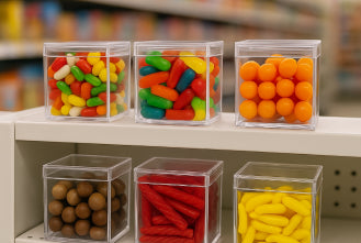
Avoid mixed materials that complicate recycling. Boxes with plastic windows, heavy wax coatings, or laminated layers are difficult for consumers to recycle properly and often end up in landfills even when the base material is recyclable. If you need a window to display your product, consider using a clear acrylic box that's fully recyclable rather than a paperboard box with a plastic window insert.
Communicate your sustainability choices on the packaging itself. A small icon or line of text indicating "100% recycled content" or "compostable packaging" reinforces your environmental commitment and guides customers on proper disposal. This messaging also differentiates your brand from competitors who may be using similar materials but not communicating it effectively.
For a deeper exploration of sustainable materials, certifications, and customer expectations, see our guide to sustainable packaging for small businesses.
Minimum order quantities vary by printing method and vendor. Digital printing can produce custom boxes in quantities as low as 50-100 units, while offset printing typically requires 500-5,000 units. Foil stamping and embossing usually become cost-effective around 500-1,000 units due to die setup costs. For very small quantities, consider stock boxes with custom stickers or stamps.
Absolutely. One-color printing can look sophisticated and intentional, especially on kraft or textured substrates. Many successful brands use one-color printing to create a minimalist, eco-conscious aesthetic. The key is executing it well—crisp registration, appropriate logo sizing, and thoughtful placement matter more than the number of colors.
Foil stamping requires a one-time die creation fee (typically $100-300) plus a per-unit application cost (often $0.15-0.75 per box depending on foil area and quantity). At 1,000 units, this might add $0.25-1.00 per box. The cost per unit decreases significantly at higher quantities as the die fee is amortized across more units.
Yes, through a flexible packaging system. Maintain consistent elements across all packaging—logo placement, typography, color palette, or a signature finishing technique—while varying other elements like box size, accent colors, or product-specific imagery. This creates a cohesive brand family where individual products are distinct but clearly related.
Start with lower-cost branded options like custom stickers, stamps, or digitally printed packaging in small quantities. These deliver professional presentation without requiring large upfront investments or high MOQs. As your sales volume and customer base grow, you can invest in more sophisticated techniques like foil stamping or embossing and order in larger, more economical quantities.