Cart
0
You may also like

Book a call with our development team to get started.


Apply online and access wholesale pricing.

Your coffee packaging is often the first touchpoint between your brand and a potential customer. In a market where specialty coffee roasters compete for attention on crowded cafe shelves and e-commerce platforms, coffee packaging design tips that balance aesthetics, function, and brand storytelling can be the difference between a one-time purchase and lasting customer loyalty. Whether you're launching a new roastery or refreshing an existing line, understanding the principles behind effective packaging design will help you stand out in 2026's competitive landscape.
This guide explores practical coffee packaging design tips that support brand differentiation—from choosing between minimalist and bold aesthetics to integrating tactile finishes, QR codes, and origin storytelling. For coffee shop owners evaluating their full packaging strategy, these insights complement broader operational considerations covered in custom packaging for coffee shops.
The specialty coffee market has matured significantly. According to the Specialty Coffee Association, coffee scoring 80 points or higher on their standardized cupping protocol qualifies as specialty grade—and roasters at this level understand that packaging is no longer just a protective layer. It's a brand asset that communicates quality, values, and positioning before a customer takes the first sip.
In 2026, packaging serves multiple roles: it preserves freshness through barrier materials and degassing valves, it conveys essential information like roast date and origin details, and it acts as a silent salesperson in both retail and online environments. When designed strategically, your packaging can command premium pricing, build recognition across multiple SKUs, and create an unboxing experience that drives repeat purchases and social sharing.
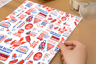
One of the first coffee packaging design tips to consider is your overall aesthetic direction. The specialty coffee industry has long favored minimalism—clean layouts, neutral tones, and restrained typography that signal craft and quality. This approach works well for roasters targeting discerning consumers who associate simplicity with authenticity.
However, bold design is gaining ground as a differentiation strategy. Brands are using high-energy colors, vibrant illustrations, and unconventional formats to stand out in saturated markets. The key is alignment: your visual identity should reflect your brand positioning and target audience. A minimalist kraft pouch with subtle embossing might resonate with customers seeking artisanal single-origin beans, while bright, playful graphics could appeal to younger consumers exploring flavored or experimental roasts.
Consider your competitive set and retail environment. If every roaster in your market uses matte black bags with gold foil, a warm terracotta palette or hand-drawn illustrations might help you claim visual territory. Conversely, if your shelf is dominated by loud, busy designs, a restrained approach can provide contrast and sophistication.
Touch is an underutilized sense in packaging design, yet it significantly influences perceived quality. Tactile finishes—matte coatings, soft-touch lamination, embossing, or textured kraft paper—add a sensory dimension that elevates the customer experience and reinforces brand values.
Matte finishes have become the default in specialty coffee because they convey modernity and premium positioning. They also reduce glare and fingerprints, maintaining a clean appearance in retail settings. Soft-touch lamination goes a step further, adding a velvety texture that feels luxurious and invites handling. For roasters emphasizing organic or sustainable sourcing, uncoated kraft paper provides an authentic, earthy feel that aligns with environmental values.
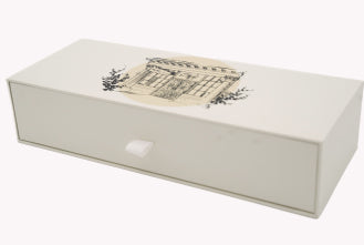
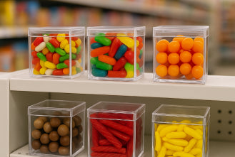
Embossing and debossing add depth and permanence to logos or key design elements. These techniques work especially well on rigid packaging like boxes or canisters, where the raised or recessed detail catches light and creates visual interest from multiple angles. When budget allows, combining tactile finishes with clear display packaging can showcase your product while maintaining a premium feel.
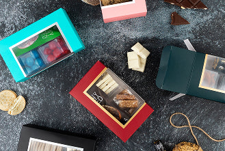
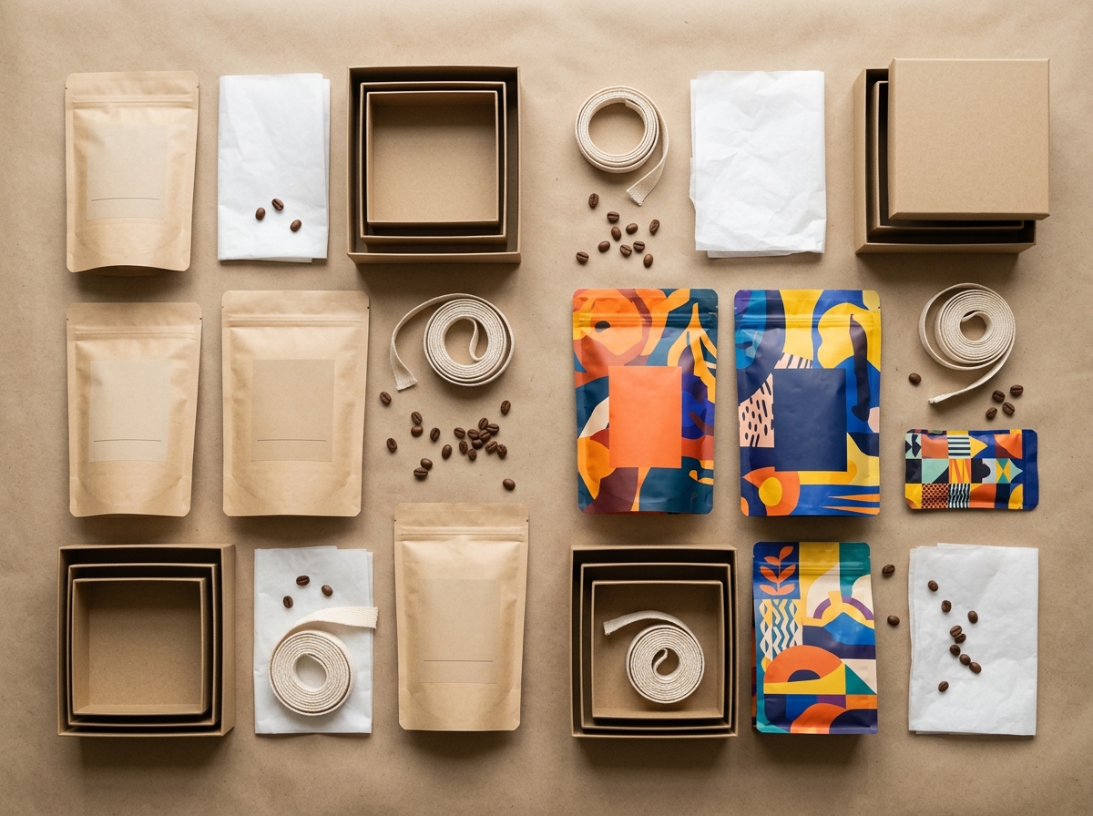
The format you choose communicates as much as the graphics printed on it. Stand-up pouches remain the dominant structure in coffee packaging because they offer excellent barrier properties, shelf stability, and printable surface area. Flat-bottom bags provide even better shelf presence and are easier for baristas to scoop from during high-volume service.
Alternative formats are emerging as differentiation tools. Tubes and canisters signal premium positioning and work particularly well for single-serve or small-batch releases. They also offer superior protection during shipping, an important consideration as direct-to-consumer sales grow. Some roasters are experimenting with paper-based cans that deliver sustainability benefits while maintaining the structural integrity needed for stacking and display.
Material choice intersects with both function and values. Kraft paper with a barrier liner balances craft aesthetics with reasonable shelf life. Recyclable mono-material structures appeal to environmentally conscious customers who have access to appropriate recycling infrastructure. Compostable films derived from plant-based polymers like PLA address end-of-life concerns but require careful communication about disposal requirements, as many consumers lack access to industrial composting facilities.
For coffee shops offering retail bags alongside beverages, consider how your packaging integrates with your full presentation. A structured display holder can elevate canned cold brew or single-serve formats at the point of sale.
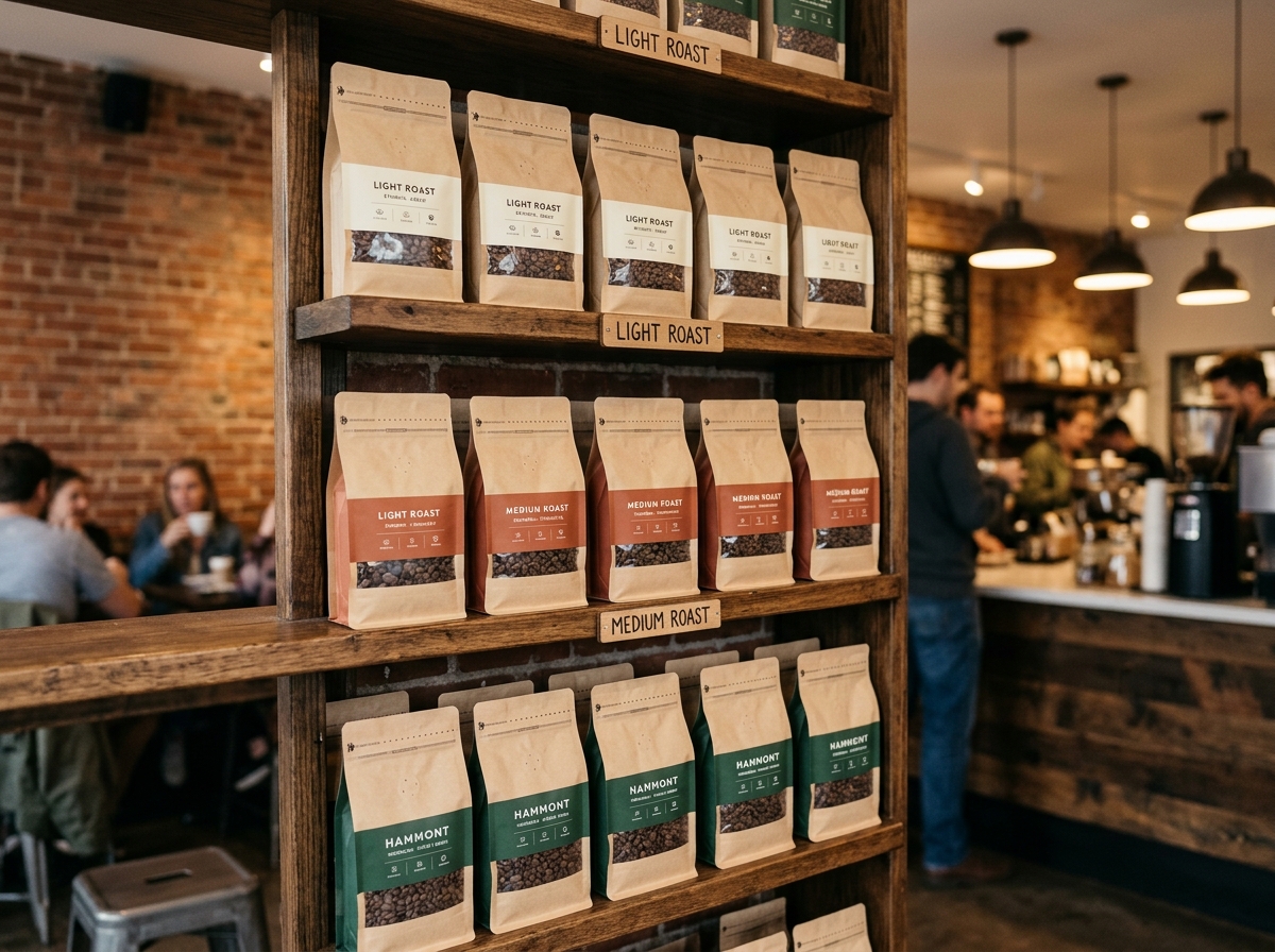
Effective coffee packaging balances brand identity with functional information. Your typography system should establish clear hierarchy: brand name and product differentiation at the top level, followed by key attributes like roast level or origin, with regulatory and technical details in supporting roles.
Flavor notes have evolved from small footer text to headline content. Roasters are setting tasting descriptors—"blueberry, dark chocolate, jasmine"—in large display type, sometimes occupying half the front panel. This approach serves customers who select coffee based on flavor profile rather than origin or roast level alone.
Producer information deserves prominence in specialty coffee packaging. Farm name, region, altitude, varietal, and processing method (washed, natural, anaerobic, honey) should be easy to locate. This transparency differentiates specialty coffee from commodity products and honors the producers behind exceptional lots. Some roasters dedicate an entire panel to origin storytelling, including photos or illustrations of the farm and brief narratives about the producer's practices.
QR codes have transitioned from afterthought to intentional design element in coffee packaging. Rather than relegating them to a back corner, forward-thinking roasters are integrating codes into their visual systems—using custom colors, incorporating them into illustrations, or pairing them with clear calls to action.
The content behind the code matters as much as the placement. Effective implementations link to lot-specific information: cupping scores, producer interviews, satellite imagery of the farm, brewing recommendations, or tasting videos. This digital layer extends the packaging experience and provides value that justifies premium pricing. It also creates opportunities for ongoing engagement, as customers who scan codes can be invited to join email lists, access exclusive releases, or provide feedback.
For roasters managing multiple SKUs or frequent seasonal releases, QR codes offer flexibility. Rather than printing extensive information on every bag, you can maintain a clean design and direct curious customers to dynamic web content that updates with each lot.
If you offer multiple roast levels, origins, or blends, a coherent color system helps customers navigate your range while maintaining brand unity. The most effective systems use a consistent structure—same logo placement, typography, and layout—with strategic color variation to differentiate products.
Color associations matter. Deep blacks and dark browns signal intense roasts and bold flavors. Soft beiges and creams suggest smooth, approachable profiles. Earthy greens hint at organic and sustainable sourcing. Bright, unexpected hues communicate experimentation and appeal to younger demographics exploring coffee beyond traditional boundaries.
Consistency builds recognition. A customer who enjoys your medium roast should be able to identify your light roast instantly based on visual cues, even if they've never tried it. This recognition translates to shelf efficiency in retail environments and faster decision-making in online contexts where customers scroll quickly through options.
Environmental impact is no longer a niche concern—it's a core purchasing factor for many coffee consumers. If your packaging incorporates recycled content, uses compostable materials, or qualifies for specific end-of-life pathways, communicate this clearly. Icons and concise copy work better than lengthy explanations.
Certifications add credibility but require verification. USDA Organic, Fair Trade, Rainforest Alliance, and Direct Trade labels must be backed by actual certification from authorized bodies. Misrepresenting certifications invites legal consequences and erodes customer trust.
Be honest about trade-offs. High-barrier packaging that preserves coffee freshness for months may not be compostable, and that's acceptable if you explain the choice. Customers appreciate transparency about why you selected specific materials and what they should do with the packaging after use. For more guidance on balancing environmental goals with budget realities, see eco-friendly packaging options that don't break the budget.
Design doesn't end with graphics. Functional elements directly impact customer satisfaction and product quality. One-way degassing valves are essential for freshly roasted coffee, allowing CO2 to escape while preventing oxygen ingress. Position valves where they won't interfere with key design elements but remain visible as a quality signal.
Resealable closures—tin ties, zip locks, or hook-and-loop fasteners—extend shelf life after opening and improve the user experience. For baristas using your coffee in commercial settings, easy-open features and closures that operate with one hand reduce friction during busy service periods.
Tear notches, perforation lines, and clear opening instructions prevent frustration. If your packaging requires specific handling—like removing an inner seal before closing a zip lock—call this out with simple icons or brief text near the closure point.
Effective coffee packaging design doesn't require unlimited budgets. Small roasters can achieve professional results by focusing resources strategically. Start with a strong structural choice and high-quality printing, then add special finishes selectively—perhaps a spot varnish on your logo or a single metallic accent rather than full-coverage foil.
Digital printing has made short runs economically viable, allowing you to test designs, offer limited editions, or customize packaging for wholesale partners without committing to large minimum order quantities. This flexibility supports experimentation and seasonal releases that keep your brand dynamic.
Stock packaging with custom labels offers another entry point. Many suppliers provide high-quality kraft or white pouches with degassing valves that accept printed labels. While this approach limits structural customization, it significantly reduces upfront investment and lead times. As your business grows, you can transition to fully custom printed bags while maintaining visual consistency through your label design system.
For roasters just starting out, understanding minimum order quantities and how to work within them helps avoid costly mistakes during the ordering process.
Even experienced designers benefit from testing before committing to large print runs. Order samples or mockups to evaluate how your design translates from screen to physical material. Colors shift between RGB and print, and finishes like matte lamination can significantly alter perceived hue and contrast.
Gather feedback from multiple perspectives. Show designs to existing customers, retail partners, and people unfamiliar with your brand. Ask specific questions: Can you identify the roast level quickly? Does the packaging communicate the quality you expect? Would you choose this over competing products on a shelf?
Test packaging in the environments where it will live. If you sell through cafes, place samples on actual shelves next to competitors. If you ship direct to consumers, pack samples as you would for orders and evaluate the unboxing experience. Small adjustments—shifting a logo placement, increasing font size, or changing a finish—can dramatically improve performance without requiring a full redesign.
Unless you have in-house design expertise, partnering with a designer who understands packaging and print production will save time and money. Look for designers with coffee industry experience or a portfolio demonstrating knowledge of flexible packaging, color management, and print specifications.
Clear communication prevents costly revisions. Provide your designer with detailed information about your brand positioning, target customer, competitive landscape, and any mandatory elements like certifications or regulatory text. Share examples of packaging you admire and explain what appeals to you—not to copy, but to establish aesthetic direction.
Supplier relationships matter as much as design quality. Choose packaging manufacturers who understand coffee-specific requirements: appropriate barrier materials, valve application, and the importance of freshness. Ask about lead times, minimum order quantities, and whether they offer design assistance or pre-flight services to catch technical issues before printing.
For coffee shops managing multiple packaging needs—retail bags, bakery boxes, and beverage carriers—working with a wholesale supplier who can coordinate across categories simplifies logistics and may unlock volume discounts. Hammont offers a range of resealable bag options suitable for coffee and complementary products like baked goods or merchandise.
Focus on three priorities: clear brand identity that differentiates you from competitors, functional elements like degassing valves and resealable closures that preserve quality, and transparent communication about origin and roast details. Start with a strong structural format and high-quality printing, then add special finishes as budget allows. Test designs with actual customers before committing to large print runs, and choose suppliers who understand coffee-specific packaging requirements.
The right choice depends on your brand positioning and target audience. Minimalist design—clean layouts, neutral tones, restrained typography—works well for roasters targeting discerning consumers who associate simplicity with craft and authenticity. Bold design with vibrant colors and unconventional graphics helps newer brands stand out in crowded markets and appeals to younger consumers. Evaluate your competitive landscape: if everyone uses similar aesthetics, a contrasting approach creates differentiation.
Treat QR codes as intentional design elements rather than afterthoughts. Use custom colors that coordinate with your palette, incorporate codes into illustrations or patterns, or pair them with clear calls to action that explain the value of scanning. Position codes where they're easily accessible but don't compete with primary brand elements. Link codes to genuinely useful content—lot information, brewing guides, producer stories, or cupping scores—rather than generic website homepages.
Stand-up pouches with high-barrier films remain the standard because they balance freshness preservation, shelf stability, and printable surface area. Kraft paper with barrier liners offers craft aesthetics with reasonable protection. Recyclable mono-material structures appeal to environmentally conscious customers, while compostable films address end-of-life concerns but require access to industrial composting. Alternative formats like tubes and paper-based cans signal premium positioning and provide superior shipping protection for direct-to-consumer sales.
Costs vary widely based on format, materials, finishes, and order quantities. Design services typically range from $1,500 to $5,000 for a complete system including multiple SKUs. Printing costs depend on minimum order quantities—digital printing makes runs of 500-2,500 bags economically viable, while offset printing requires larger volumes but offers lower per-unit costs. Special finishes like foil stamping or embossing add $0.10-$0.50 per unit. Budget-conscious roasters can start with stock packaging and custom labels, then transition to fully printed bags as volume grows.
Coffee packaging design is an investment in brand equity. When executed strategically, it differentiates your roastery in competitive markets, communicates quality and values before the first sip, and creates memorable experiences that drive customer loyalty. The most effective coffee packaging design tips balance aesthetics with function—beautiful graphics that also preserve freshness, tactile finishes that signal quality, and clear information that builds trust.
Start by defining your brand positioning and target customer, then make design decisions that reinforce that positioning consistently across all touchpoints. Test designs in real-world environments, gather feedback from multiple perspectives, and iterate based on what you learn. Partner with designers and suppliers who understand coffee-specific requirements and can guide you through technical considerations.
Whether you choose minimalist restraint or bold experimentation, kraft authenticity or premium finishes, the goal remains the same: packaging that tells your story, honors exceptional coffee, and invites customers into an ongoing relationship with your brand. For coffee shop owners ready to evaluate their complete packaging strategy—from retail bags to bakery boxes and beyond—explore our complete guide to custom packaging for coffee shops.