Cart
0
You may also like

Book a call with our development team to get started.


Apply online and access wholesale pricing.
Are you staring at a half-empty gift tray, wondering why it looks so sad despite the quality items inside? The truth is, abundance creates luxury, and yes, this can be cleverly crafted.
People often spend way more than planned, frantically adding extra items just to make a tray look complete. But you don’t need to go over budget to get that “full” look. This article unveils the secret to making trays look full, without spending too much! These simple strategies work well for various gifts, whether you’re preparing corporate gifts, special occasion presents, or building your own gift business. So, let’s dig in.
First impressions happen in seconds. A beautifully presented tray immediately communicates thoughtfulness and value before anyone examines what's inside.
For businesses, presentation directly impacts how customers perceive your brand and products. For personal gifting, it elevates the entire giving experience.
And here’s the thing: Even modest items can look premium when presented with intention. Your gift recipients or customers will appreciate the visual appeal and feel like they’re getting something special. So, where should you start?
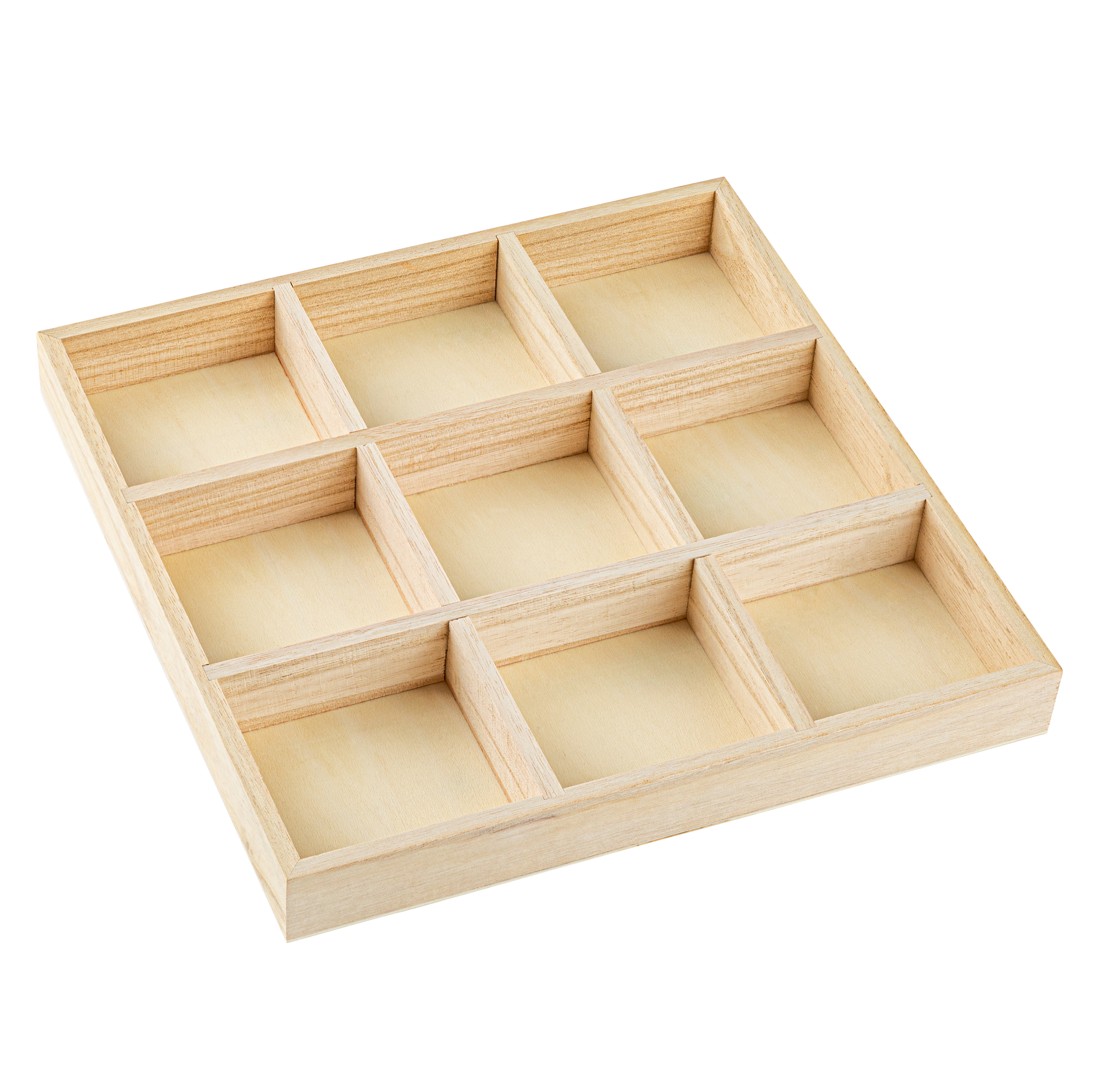
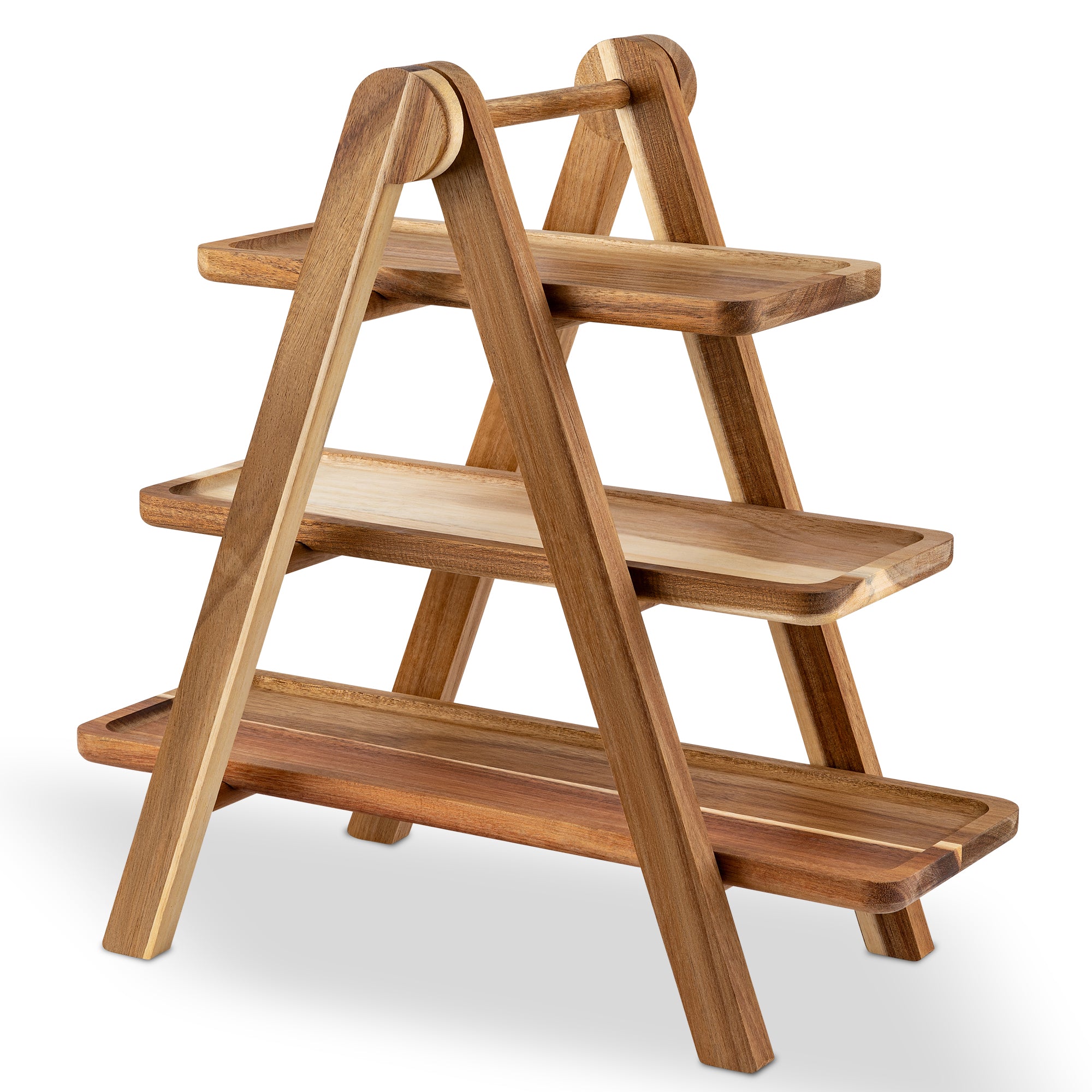
The most common mistake is starting with a tray that’s too large. This immediately creates the problem you’re trying to solve. So, work backward instead. Gather the items you plan to include, arrange them roughly, then select a tray that accommodates them with just a little breathing room.
Also, something to keep in mind: Shallow trays with lower sides create an instant feeling of fullness compared to deep baskets. The eye perceives items sitting higher as more abundant.

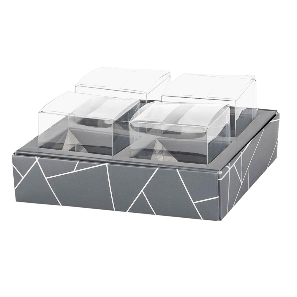
You may also want to consider alternatives to trays, such as wooden crates, gift boxes, or even large mugs, which can make smaller gift collections look perfectly portioned.
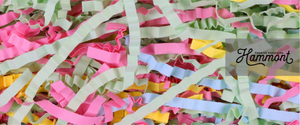
Fillers are your secret weapon for creating fullness without adding significant cost. They provide structure, height, and visual interest.
Some common examples include shredded paper, crinkle cut paper, tissue paper, fabric napkins, or small scarves.
The best technique for these fillers is simpler: layer your fillers! Start with crumpled kraft paper at the bottom for height, then add a layer of more attractive filler on top. This saves money and reduces weight.
Position filler higher toward the back of the tray and lower in front to create a sloped display surface. This approach uses less filler while making products more visible.
Position taller items toward the back, medium-height items in the middle, and smaller items up front. This creates depth and allows the eye to see everything at once. It also prevents smaller items from disappearing behind larger ones.
Instead of placing items in straight rows, arrange them at angles. This creates natural nooks where items nestle together, eliminating empty spaces.
Another note: Group smaller items together, such as two mini jars of jam tied with twine, or three soaps bundled with raffia. This creates “focal points” that look intentional rather than sparse.
Every well-designed tray needs one to two anchor items that draw attention. These items create interest and make other elements look like supporting characters. Some common examples include a quality candle, a beautiful mug, or a distinctive wine bottle.
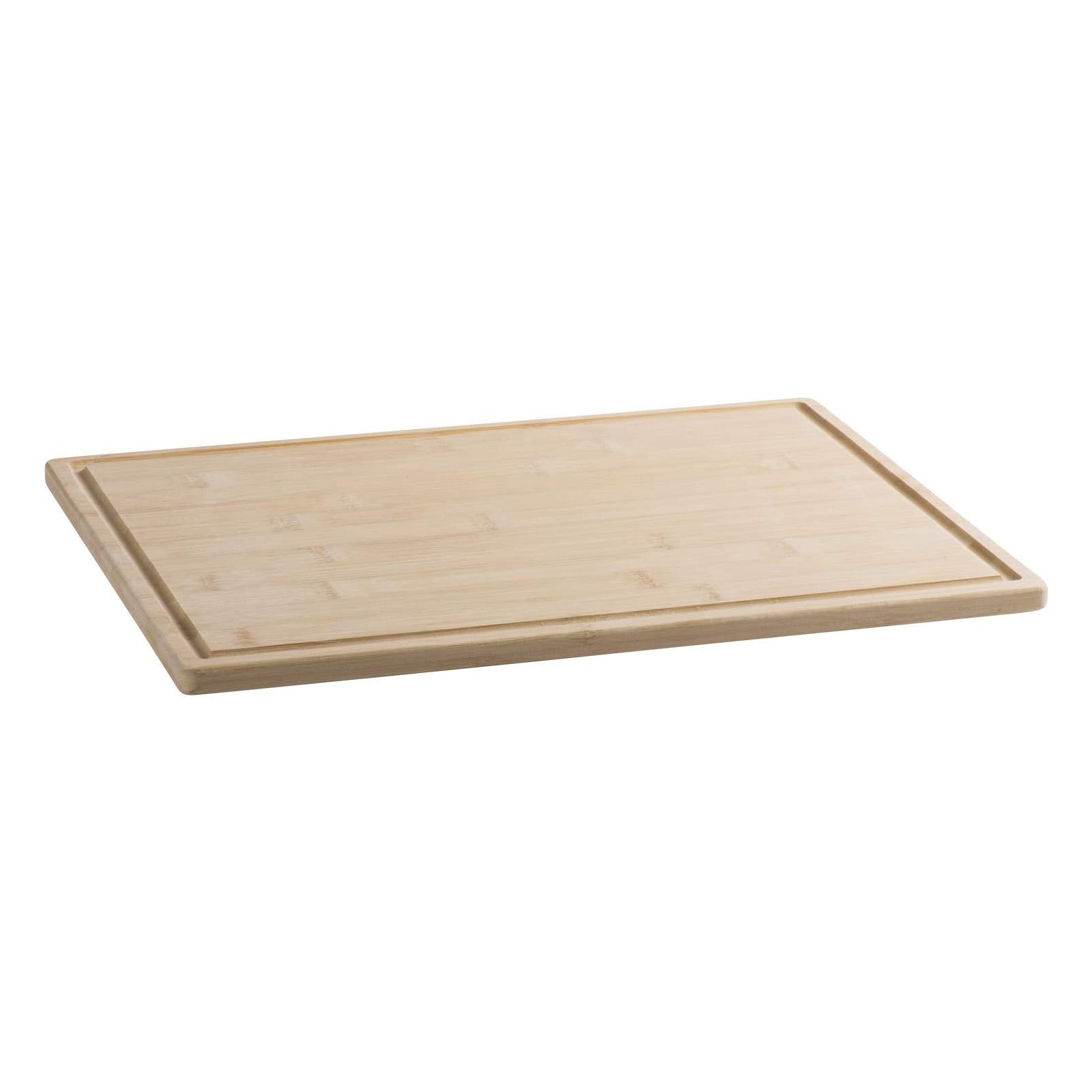
Position it slightly off-center for a more dynamic arrangement. And don’t overlook empty-but-beautiful props. A small bud vase, decorative mini cutting board, or seasonal ornament adds volume without adding much cost.
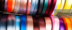
A well-placed ribbon across the tray or wrapped around grouped items also instantly creates cohesion!
When items share a color story, they look like an intentional collection rather than random products. This cohesion makes fewer items feel like enough.
So, try limiting your palette to two to three colors that work together. Even inexpensive items look curated when they share a color theme. And keep in mind that the tray itself is part of your color story! So, make sure it matches, too.
Travel or mini sizes of premium brands often have the same luxurious packaging as full sizes, but at a fraction of the cost. They take up less space while still offering “more.”
If you’re making numerous trays, buy shareable items in bulk and split them across multiple trays. This works particularly well for chocolates, tea packets, and small packaged snacks.
You could also include gift cards or experience vouchers; they take up minimal physical space while potentially representing the highest value item in your tray.
Don’t forget the finishing touches, either! Wrap the entire tray in clear cellophane and add a ribbon. This simple step adds volume, protects the contents, and creates a finished, professional look.
Overall, creating a gift tray that looks abundant doesn’t require overspending. It simply takes thoughtful selection of the right-sized container, strategic use of fillers, intentional arrangement, and cohesive design elements.
Ready to create gift trays that make a big impression without the big expense? Shop our selection of trays today.