Cart
0
You may also like

Book a call with our development team to get started.


Apply online and access wholesale pricing.
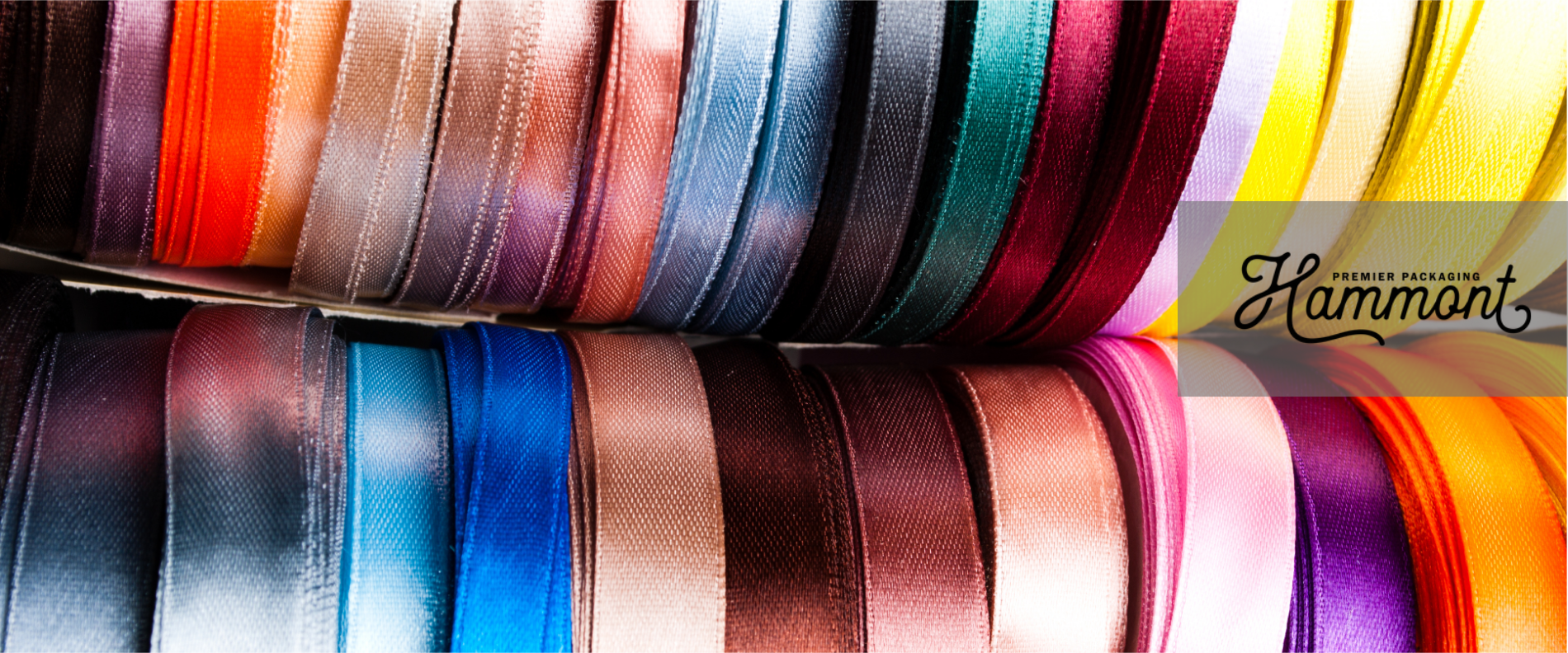
The right ribbon transforms an ordinary gift into something extraordinary, instantly elevating its perceived value. Thoughtfully chosen colors create an emotional connection before the recipient ever sees what’s inside!
After all, color psychology plays a powerful role in how we perceive gifts, triggering specific emotions and setting expectations. When it comes down to it, a perfectly matched ribbon ties everything together visually, creating a cohesive presentation that feels intentional and professional.
Whether it’s a corporate gift, wedding favor, or retail packaging, color coordination makes a lasting impression. So, let’s help you select the right color ribbon for your packaging type. What works best for your goal?
Color speaks a universal language, triggering emotional responses before words are even exchanged. A carefully chosen ribbon communicates thoughtfulness and attention to detail that recipients immediately recognize.

That simple strip of satin or plastic transforms basic packaging into a memorable statement piece. It elevates even modest wrapping into something worth photographing and sharing on social media.
For businesses, in particular, consistent ribbon colors reinforce brand identity across every customer touchpoint. Your signature bow becomes part of your visual storytelling, making packages instantly recognizable.
Either way, however, a perfectly matched ribbon creates that pause of appreciation before the gift is even revealed!
| Packaging Color | Recommended Ribbon Colors | Ideal Use Cases | Notes |
|---|---|---|---|
| White | Gold, Navy, Blush Pink, Black, Festive Seasonal Colors | Weddings, Luxury Goods, Holiday Gifts | Extremely versatile; great base for experimenting with ribbon colors |
| Black | Gold, Silver, Red, Pastels, Black (Tone-on-Tone) | High-End Products, Valentine’s Day, Tech Items | Creates contrast easily; texture plays a key role in refinement |
| Kraft (Brown) | Olive Green, Cream, Burnt Orange, Burgundy, Jute/Twine | Eco-Friendly Products, Fall Themes | Earth tones work best; perfect for artisanal or handmade brands |
| Pastel | White Satin, Silver, Complementary Pastels, Navy | Baby Gifts, Spring Themes, Self-Care Boxes | Works well with soft ribbons and added texture |
| Bright Colors | White, Gold, Complementary Bold Colors, Deep Rich Tones | Kids' Gifts, Party Favors, Bold Brand Campaigns | Ribbon width changes the tone—wide = dramatic, thin = playful |
Complementary colors sit opposite each other on the color wheel, creating vibrant combinations that naturally catch the eye. So, consider trying a blue ribbon on orange packaging for a striking, memorable presentation. Contrasting colors work when you want the ribbon to stand out as a focal point.
For subtle elegance, choose ribbons within the same color family as your packaging. For example, if your gift box is a soft blush pink, use a ribbon in a slightly deeper rose or dusty mauve for a tone-on-tone look that feels refined and cohesive.
White packaging, on the other hand, offers unlimited possibilities—try metallics for luxury, bright colors for celebrations, or earth tones for organic brands. Additionally, Kraft paper’s warm neutrality goes well with burgundy, forest green, navy, or rustic twine.
Black packaging exudes sophistication with gold, silver, or white ribbons creating a timeless contrast. Bold, saturated ribbons match equally bold packaging for high-energy presentations, perfect for children’s gifts.
Then, pastel ribbons complement other soft-toned packages, creating a cohesive, gentle impression ideal for baby gifts or spring themes. Meanwhile, monochromatic schemes using varying shades of one color create sophisticated, minimalist presentations.
The texture contrast between ribbon and package often matters as much as color itself, too, so this is something to keep in mind when you make your selections.
Let’s take a closer look at specific ribbon pairings for the most popular packaging colors! These combinations are beloved favorites.
White boxes and bags give you a clean, versatile base that pairs beautifully with almost any ribbon color. A gold ribbon instantly elevates the look, adding a touch of luxury—perfect for premium products or elegant events.
For something classic and polished, navy ribbon offers a timeless, nautical vibe. If you’re after a softer, more romantic feel—especially for weddings or beauty brands—blush pink is a lovely choice that adds gentle warmth.
Black ribbon makes a bold statement against white packaging and looks striking in photos, making it ideal for eye-catching social media content. Want to embrace the season? Simply switch in a festive ribbon to create a holiday-ready look that still feels refined.
Black packaging, like white, gives an easy base to start with. It also instantly signals sophistication and high-end quality—it makes a strong first impression. Pair it with silver ribbon for a sleek, modern look that works especially well for tech items or elevated gifts for men.
Gold ribbon takes black packaging to the next level, creating a luxurious feel that’s perfect for jewelry, premium skincare, or cosmetics. For something bold and eye-catching, red ribbon adds striking contrast—ideal for Valentine’s promotions or brands with a daring edge.
In contrast, pastel ribbons offer a fresh twist, softening the black for a more playful or unexpected touch. And for a minimalist approach, black ribbon on black packaging—especially with different textures like satin or grosgrain—creates a refined, design-forward presentation.
Kraft packaging suggests authenticity, eco-consciousness, and artisanal quality. This is ideal for the eco-conscious recipient. But what colors pair best with it?
Well, olive green ribbon enhances Kraft's natural appeal, perfect for organic products or outdoor-themed gifts. Cream ribbon, meanwhile, creates a soft, neutral palette that lets your product remain the focus. Burnt orange or deep burgundy ribbons further complement Kraft’s warm undertones for perfect fall or holiday presentations.
Jute or twine further reinforces the eco-friendly message of kraft packaging, appealing to environmentally conscious consumers.
Pastel packaging immediately signals gentleness, making it ideal for baby gifts, spring themes, or self-care products. Here are some ideas:
White satin ribbon elevates pastel packaging with a clean, crisp finish that looks professionally done.
Silver adds subtle sparkle that enhances pastels without overwhelming their soft appeal.
Complementary pastels—like lavender ribbon on mint packaging—create harmonious, Instagram-ready presentations that feel cohesive.
Deeper tones from the same color family create sophisticated dimension, like navy ribbon on baby blue.
Additionally, pastel packages benefit from textured ribbons that add tactile interest to the soft color palette.
Bright packaging brings an instant sense of joy and energy—it’s a go-to for playful brands and kids’ gifts that need to stand out. A simple white ribbon keeps the focus on the packaging itself, offering a clean contrast that lets bold colors take center stage.
Adding a gold ribbon introduces just the right amount of elegance, striking a balance between fun and sophistication. For a high-impact look, go bold with complementary colors—like a vibrant purple ribbon on a sunny yellow box—for a presentation that’s hard to forget.
If you want to tone things down a bit, choose ribbon in a deeper, richer hue to ground the brightness and create a more polished finish. Ribbon width also makes a big difference here: opt for thin ribbons when you want a light accent, or go wide to make a confident, dramatic statement.
Consider your entire visual presentation as a single composition that tells a complete story. When too many elements compete for attention, the message gets lost. Keep it cohesive and intentional.
Also, be mindful of how colors interact—warm ribbons on cool-toned packaging can feel off if you’re not aiming for contrast. It’s always a good idea to test your color combos under different lighting. What looks great on your desk might look totally different in natural light.
When in doubt, order samples—especially for specialty ribbons or for large batched gifts. And it always helps to have a small stash of go-to ribbons that work across different packaging styles to save time and stress. In the end, simplicity often wins. A well-chosen ribbon shows you’ve thought about the details—and that’s what truly leaves a lasting impression!