Cart
0
You may also like

Book a call with our development team to get started.


Apply online and access wholesale pricing.

There’s something special about receiving a beautifully wrapped gift box. Even before we untie the ribbon, our brains start picking up on visual cues—especially color—that spark emotional reactions. In fact, the color quietly shapes how we feel, what we expect, and even how we behave. This is the power of color psychology, and it plays a surprisingly significant role in how we experience a gift, starting from the very first glance.

Ultimately, the colors you choose set the tone and shape the recipient’s expectations before they even peek inside. So, in this article, we take a closer look at how color psychology works when it comes to gift presentation, explore what different colors tend to communicate, and more!
Color psychology examines how different colors interact with our minds and emotions, ultimately influencing our perceptions and decisions. In packaging and marketing, these principles become powerful tools that shape consumer reactions before any conscious evaluation begins. The colors adorning a gift box or package trigger immediate emotional responses, establish perceived value, and create lasting first impressions that extend to the contents within.
Research has long shown that color plays a role in shaping consumer behavior. In fact, some studies suggest that up to 90% of snap judgments about products can be influenced by color, especially when it comes to first impressions. One well-known example comes from a case study by HubSpot, where changing a call-to-action button from green to red led to a 21% increase in conversions, demonstrating just how impactful a color shift can be.
For gift boxes specifically, the psychology runs even deeper. Unlike standard product packaging that primarily aims to drive purchases, gift boxes serve as emotional vessels—carriers of sentiment, celebration, and connection. Before the recipient discovers what’s inside, color has already whispered promises about the thought, value, and feeling behind the gift.
Different colors evoke distinct emotional and psychological responses, so here are what some of the most common colors give way to:
The color of passion and excitement stirs the emotions and creates a sense of urgency. Red gift packaging signals boldness and energy, making it ideal for romantic gestures, Valentine’s gifts, or celebrations calling for dramatic flair.
The eye naturally gravitates toward red, ensuring your gift commands immediate attention. In fact, you’ll notice that many luxury brands incorporate red packaging to convey power and prestige.
Consistently ranked as the world’s favorite color, blue evokes feelings of trust, reliability, and calm. Corporate gift boxes often leverage various blue tones to communicate professionalism and dependability. Lighter blues suggest tranquility and openness, making them perfect for wellness or self-care gift collections. Meanwhile, deeper navy tones convey authority and exclusivity.
Overall, the psychological comfort blue provides makes recipients feel secure and valued even before opening the gift.

As nature’s dominant color, green immediately connects viewers with concepts of growth, renewal, and environmental consciousness. For eco-friendly or organic gift collections, green packaging creates immediate alignment between the container and its contents.
The restorative quality of green makes it particularly effective for wellness gifts, while its association with luck and prosperity suits congratulatory occasions. Different green shades communicate distinct messages—from vibrant spring greens suggesting energy to deeper forest tones indicating luxury and tradition.
The color of sunshine captures attention and radiates optimism; yellow is perfect for celebratory occasions or gifts intended to uplift spirits.
Yellow packaging creates immediate associations with happiness and vitality, though its high-visibility nature means it's best used thoughtfully, either as an accent or in softer tones for more sophisticated applications.
Historically associated with royalty and spirituality, purple packaging immediately elevates perceived value and luxury. The rarity of purple in nature contributes to its ongoing association with exclusivity and special occasions.
Deeper purples convey sophistication and contemplation, while lighter lavenders suggest romance and nostalgia. The mysterious quality of purple makes it particularly effective for artistic, spiritual, or high-end luxury gifts where intrigue enhances the unboxing experience.
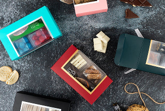
The ultimate contrasting pair creates a striking visual impact while communicating timeless elegance. Black gift boxes exude sophistication, exclusivity, and premium quality, making them staples in luxury packaging.
White, on the other hand, suggests purity, simplicity, and new beginnings, offering a clean canvas that elevates colorful contents or ribbons.
Together in minimalist designs, they create a modern, photography-friendly aesthetic, particularly effective for memorable unboxing experiences and social media sharing.
Beyond its traditional feminine associations, pink has evolved into a versatile hue spanning from playful bubble-gum shades to sophisticated dusty roses. Soft pinks evoke nurturing and compassion, making them effective for personal care gifts. Meanwhile, brighter pinks signal youthful energy and confidence.
| Color | Emotional Meaning | Ideal Gift Occasions | Packaging Notes |
|---|---|---|---|
| Red | Passion, Excitement, Urgency | Romantic gifts, Celebrations, Valentine's | Bold and attention-grabbing; often used in luxury |
| Blue | Trust, Calm, Reliability | Corporate gifts, Wellness packages | Soothing and professional; deeper blues for exclusivity |
| Green | Growth, Renewal, Natural | Eco-friendly, Wellness, Congratulations | Aligns with nature; vibrant greens for energy, dark for tradition |
| Yellow | Joy, Optimism, Vitality | Birthdays, Cheer-up gifts, Celebrations | Best as accent; use soft shades for elegance |
| Purple | Luxury, Mystery, Spirituality | Artistic, Spiritual, High-end gifts | Light lavenders for romance, deep purples for prestige |
| Black | Sophistication, Exclusivity | Luxury, Corporate, Minimalist themes | Powerful in matte; pairs well with metallics |
| White | Purity, Simplicity, New Beginnings | Weddings, Baby showers, Minimalist gifts | Clean and versatile; great canvas for color accents |
| Pink | Compassion, Youthfulness, Romance | Personal care, Feminine gifts, Celebrations | Dusty pinks for elegance; bright pinks for boldness |
The right colors can turn a simple gift into something that feels thoughtful and personal. Classic tones like navy, black, and silver for corporate events give off a polished, professional vibe. Holiday gifts shine when wrapped in familiar seasonal shades—think red and green for Christmas or deep blues and silver for Hanukkah.
Wellness-themed gifts pair perfectly with soft, calming colors like sage, aqua, or warm neutrals, helping set the tone for relaxation. For a more luxurious feel, rich jewel tones, matte black, and metallic golds or coppers instantly elevate the unboxing experience.
But keep in mind that color preferences aren’t one-size-fits-all. Age, culture, and personal style all play a role! Thus, tailor your gift packaging and its color to the recipient and the occasion. At the end of the day, choosing the right colors adds a thoughtful touch that makes your gift feel even more special.